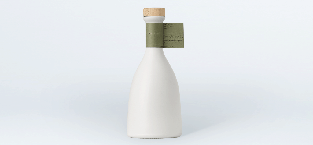
“Each physical part of the product has been carefully selected, respecting all the materials and processes used.
The bottle design, curved with greater weight in the bottom of the mouth, broad base and narrow neck. The label paper, tinted origin, with a minimal design, and a rational layout of the stopper, made of natural wood.
The choice of the full glazing of the bottle responds to a cultural issue.
From the ancient Greece oils were stored in different ceramic recipients, to keep their qualities and thus, ceramic objects were part of the gastronomic art through the history of mankind.
Nail polish bottle is integral and white with a warm dominant provided by the addition in the mixture of black and yellow. During this process we have designed a natural and nice texture to the touch, and a clean, minimal and serene aesthetic.
Lacquered also prevent contact of light, keeping the oil entire cycle in its bests conditions.
We kept the glass of the bottle and the dispenser dark, contrasting the interior and creating a cozy space for oil.
The label is arranged in a flag on the neck of the bottle, in a high quality paper and kept raw, without plasticizing or varnishing and without adding more processes beyond the printing, looking for a method according to the natural fiber and pore of the paper. The design and color of the label also remind us to the field, the olive tree, the branch, the leaf.
The stopper creates a chromatic contrast, and the touch between the glass and the natural Wood, crowning with warm tones the reduced chromatic range, of compound colors, used in the whole product.
We have achieved several objectives proposed since the beginning of the project, creating an elegant and recognizable product, generating presence in the market, respect and taking maximum care of the materials used, transmitting the qualities and values of the oil, and ultimately create an iconic object, visible as a domestic product..”